By Jonathan Ruiz
Few things transform a home as quickly as paint. The right color can make a room feel larger, warmer, calmer, or more energized. The wrong one can undercut beautiful furniture, fight with natural light, and make a space feel unsettled in ways that are hard to pinpoint. Knowing how to choose colors for a room comes down to understanding a handful of principles that apply whether you're painting a bedroom in Brentwood, refreshing a kitchen in Beverly Hills, or preparing a Santa Monica home to sell. Once you understand the logic, the decisions get a lot easier.
Key Takeaways
- Light is the single most important factor in how a paint color looks in a finished room
- Undertones matter more than the color itself; two whites or two grays can feel completely different depending on their underlying hue
- Different rooms have different functional needs that should guide color choices before aesthetics do
- Testing paint samples on the actual wall is the only reliable way to evaluate a color before committing
Start With Light, Not Color
The most common mistake homeowners make when choosing paint is falling in love with a color on a chip or a phone screen and expecting it to look the same on the wall. It won't. The way a color reads in a room is determined almost entirely by the light in that specific space, and light varies dramatically depending on the direction a room faces, the time of day, and the artificial fixtures you're using.
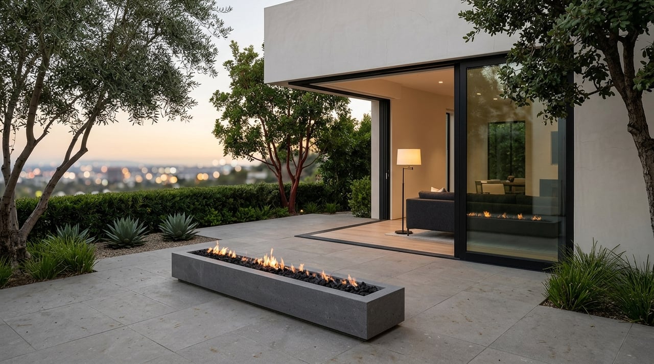
In Los Angeles, this is especially worth understanding. Rooms with west-facing windows receive warm, golden afternoon light that enriches warm tones and can make cool blues or grays look unexpectedly muddy. North-facing rooms receive cooler, more consistent light throughout the day, which tends to flatten warm colors and make them look dull. South-facing rooms get the most consistent, balanced natural light and are the most forgiving for most color families.
In Los Angeles, this is especially worth understanding. Rooms with west-facing windows receive warm, golden afternoon light that enriches warm tones and can make cool blues or grays look unexpectedly muddy. North-facing rooms receive cooler, more consistent light throughout the day, which tends to flatten warm colors and make them look dull. South-facing rooms get the most consistent, balanced natural light and are the most forgiving for most color families.
How To Evaluate A Color In Your Specific Room
- Paint a large sample swatch directly on the wall rather than relying on small chips
- Observe the swatch at different times of day: morning, midday, and evening with artificial lights on
- Hold the swatch against your fixed finishes to make sure it works with what isn't changing
- Check the swatch in both daylight and under your actual light fixtures, which may have warm or cool color temperatures
Understand Undertones Before Choosing A Color
Every paint color has an undertone — a secondary hue that sits beneath the dominant color and becomes visible as the light shifts. This is why one white can feel crisp and clean while another feels yellow or pink, and why two gray samples that look similar on a chip can read completely differently once they're on the wall.
Warm undertones tend to read as cozy and inviting, and they pair naturally with wood tones, warm metals like brass and bronze, and the stone and plaster finishes. Cool undertones read as calm and airy, which works well in contemporary homes and spaces where you want a sense of openness. Understanding undertones lets you predict how a color will behave before it goes on the wall.
Warm undertones tend to read as cozy and inviting, and they pair naturally with wood tones, warm metals like brass and bronze, and the stone and plaster finishes. Cool undertones read as calm and airy, which works well in contemporary homes and spaces where you want a sense of openness. Understanding undertones lets you predict how a color will behave before it goes on the wall.
A Simple Way To Read Undertones On Any Paint Chip
- Hold the chip next to a true white and the undertone will immediately become visible by contrast
- Compare two chips in the same color family side by side to see how their undertones differ
- Look at what the undertone does to the chip in the context of your flooring and cabinetry
- When in doubt, pull toward a neutral that shares the same undertone family as your dominant fixed finishes
Match Color Purpose To Room Function
Every room has a primary function, and that function should guide your color direction before you start looking at swatches. A bedroom serves a different purpose than a home office, which serves a different purpose than an open living and dining area. Treating color purely as an aesthetic choice is one of the most common reasons a paint color feels wrong even when it looks beautiful on a chip.
Rooms designed for rest and recovery tend to benefit from softer, less saturated tones that reduce visual stimulation. Rooms designed for focus often benefit from deeper, more grounding colors that create a contained, intentional atmosphere. Rooms designed for connection and gathering can handle more personality and warmth, since the energy of those spaces tends to be more active.
Rooms designed for rest and recovery tend to benefit from softer, less saturated tones that reduce visual stimulation. Rooms designed for focus often benefit from deeper, more grounding colors that create a contained, intentional atmosphere. Rooms designed for connection and gathering can handle more personality and warmth, since the energy of those spaces tends to be more active.
Color Direction By Room Function
- Bedrooms: Softer, desaturated tones in warm neutrals, muted greens, or quiet blues that support rest without competing for attention
- Home offices: Deeper, more grounded tones that create visual containment and encourage focus without feeling oppressive
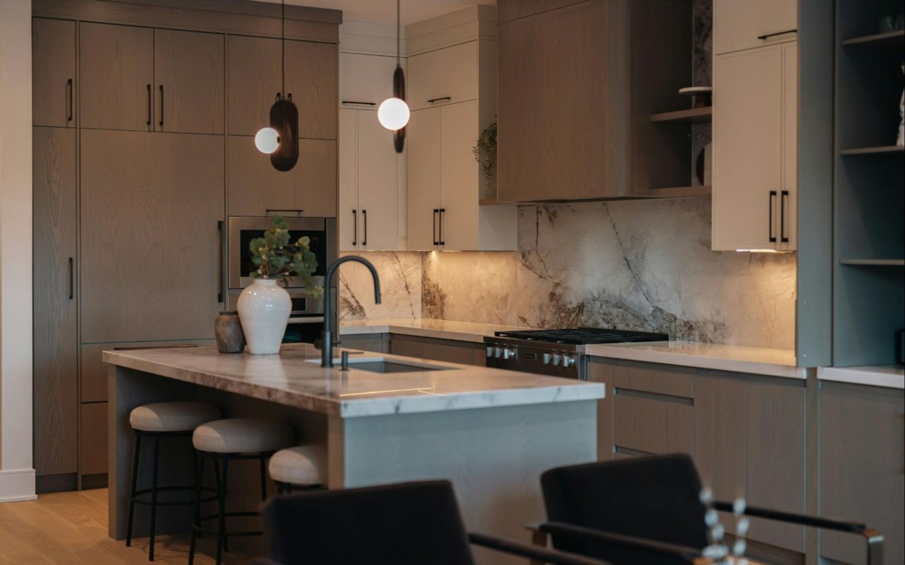
- Living and dining areas: Warmer, more inviting tones with enough personality to feel intentional, layered with textiles and lighting
- Bathrooms: Lighter tones that maximize any available natural light, or deeper tones used deliberately in a spa-like approach with strong artificial lighting to compensate
Use Color Flow To Connect Spaces
In open-concept homes, color choices in one room are always visible from adjacent spaces. A palette that works beautifully in isolation can feel jarring or disjointed when seen alongside neighboring rooms. Color flow is the practice of choosing tones across a home that feel related even when they differ.
The most reliable approach is to establish a consistent undertone family throughout the home's shared spaces and let individual rooms move warmer or cooler, lighter or deeper, within that family. This creates cohesion without making every room look the same. An open living-kitchen area might share a warm neutral base, with the kitchen moving toward a slightly more saturated version and the living area pulling toward a lighter, airier tone.
The most reliable approach is to establish a consistent undertone family throughout the home's shared spaces and let individual rooms move warmer or cooler, lighter or deeper, within that family. This creates cohesion without making every room look the same. An open living-kitchen area might share a warm neutral base, with the kitchen moving toward a slightly more saturated version and the living area pulling toward a lighter, airier tone.
How To Build A Cohesive Color Palette Across Rooms
- Choose one undertone family for all shared and visible spaces and stay within it, even as values and saturations vary
- Use the 60-30-10 principle as a guide — 60% dominant color, 30% secondary tone, 10% accent — to maintain visual balance
- Transition between rooms using changes in value (lighter vs. darker) rather than shifts in undertone, which tend to clash
- Test adjacent colors on the wall at the same time and evaluate them in the actual doorway or opening between the spaces
FAQs
How do I choose colors for a room if I'm not confident about design?
Start with your fixed finishes and pull a color from within those rather than introducing something unrelated. Most fixed finishes have a dominant tone and an undertone that, once identified, give you a reliable direction for the walls.
Does paint color affect how a home shows when selling?
It does, and it's one of the most cost-effective things you can do before listing. Buyers respond to spaces that feel cohesive, well-lit, and move-in ready. Bold or unusual color choices can make it harder for buyers to visualize themselves in the space. Neutral, warm tones that work with natural light and complement the home's architecture tend to photograph better and generate broader appeal.
Should I use the same color throughout the whole house?
Not necessarily, but you should use colors that feel related. A single color throughout can create a sense of calm cohesion, but it also removes the opportunity to give individual rooms their own character. A more effective approach is to use a consistent undertone family across shared spaces and allow rooms to move within that family based on their function and the amount of natural light they receive.
Contact Jonathan Ruiz Today
Color is one of the most powerful tools you have to shape how your home feels, and one of the most accessible. Whether you're refreshing your current home or preparing to sell, I work with homeowners across Hancock Park, Brentwood, Beverly Hills, Santa Monica, and the surrounding areas and am happy to share what makes a real difference in this market.
Reach out to me, Jonathan Ruiz, and let's talk about what your home needs.
Reach out to me, Jonathan Ruiz, and let's talk about what your home needs.